New feature development: E2E flow and notifications
Designing the full user journey for a notification feature that helped bring players back into in-game activities.
Platform:
Meta Horizon
Scope:
End-to-end flow, UX writing, documentation, policy review
Partners:
Engineering, game developers, product design, policy, and channel partners
The problem

Game creators using Meta Horizon were lacking a engagement tool they could use to bring players back to their game. UXR showed that they wanted a low-effort way to re-engage players after they had started an in-game activity. The challenge was to design a system that was both easy to use and compliant with platform policies.
This required more than clear labelling, it needed a cohesive end-to-end experience covering onboarding, setup, guidance, notification creation, and performance feedback.
Without this structure, creators lacked clarity on when to use the feature and how their notifications would be reviewed, while the policy team needed assurance that violations would be prevented at scale.
The process
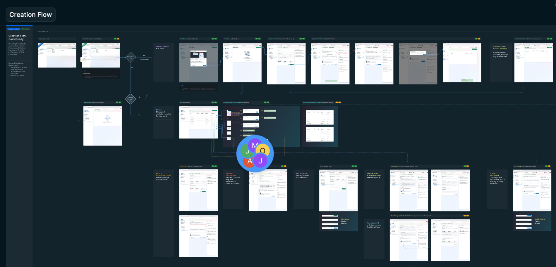
End-to-end flow and content system design
I worked closely with product design to shape the end-to-end flow and supporting language system. This included clearer terminology, more direct actions, improved onboarding guidance, and content that reduced ambiguity at key decision points.
Content design principles and terminology system
I applied core content design principles throughout, using plain language to explain complex concepts and ensuring accessibility across different creator experience levels. I also developed a consistent terminology system to clarify the feature’s scope, constraints, and expected usage.
Cross-functional alignment and policy integration
I collaborated with product design and the policy team to ensure consistency and compliance across the experience. This included aligning on a shared design system for labels, errors, and confirmation states, and translating policy requirements into clear, user-friendly guidance rather than rigid rules.
Iteration, accessibility, and supporting documentation
I iterated the journey end-to-end—from setup and message creation to review and performance understanding—using user testing and cross-functional feedback. I also created supporting documentation to complement in-product guidance, ensuring the UI remained concise while still providing deeper help when needed. Accessibility principles—such as plain language, clear hierarchy, and scannable structure—were applied throughout.
The result

The work created a clearer end-to-end model for a complex retention feature, bringing UX writing, onboarding, policy guidance, and documentation into a single cohesive system.
It improved the creator journey by making the feature easier to understand and use, while demonstrating how content design can support both usability and stakeholder confidence in sensitive flows.
The policy team gained greater confidence that creators understood compliance requirements, helping reduce review friction and support needs. Creators were also more willing to adopt the feature due to clearer, more accessible guidance.
Overall, the project showed how content design principles can embed policy compliance naturally into the user experience rather than presenting it as a barrier.